
Academy Module 8 — Analytics & Reporting: Read the Numbers That Tell You What to Fix
The written walkthrough of Academy Module 8. Set the reporting window, read a metric card and its formula, break it down by tag, assignee or channel, build a board your team can share, check agent performance, and let the Daily AI Report tell you what changed overnight.
Also searched as: Academy Module 8 — Analytics & Reporting: Read the Numbers That Tell You What to Fix, What this module covers, Open Analytics and get your bearings, Set the reporting window, Choose how finely to slice it, Read one card, and check what it actually counts, The controls every card carries, Break a metric down by a property, Filter one card to a slice, Change how a card is drawn, Compare with last period, or take the data away, Add a metric the board is not showing, Save the board, then decide who else sees it, Switch to Agent Performance, Read the per-agent leaderboard
🎓 Part 8 of 11 — ChatDaddy Academy. This is the written version of the Analytics & Reporting module. The module has two video lessons — How to use the Dashboard (1:13) and How the Dashboard analyses your WhatsApp data (2:57) — and this article follows the same two halves: first how to drive the board, then what every number on it actually means. Read it on its own, or keep it open beside the videos on the Academy page.
Modules 2 to 7 built the machine: a connected channel, a shared Inbox, broadcasts, an AI agent, automations and a tagged contact list. This module is where you find out whether any of it is working. Analytics is the chart icon at the top of the left rail, and it answers the questions you cannot answer by scrolling the Inbox — are we replying faster than last month, which tag brings in the most chats, which agent is quietly drowning, and how many of the messages we send actually get delivered.
One thing to be clear about before you start: nothing on this page is a vanity number. Every metric here has a formula, the app will show it to you, and each one points at something you can change. The second half of this article lists every formula so you can check the ones you plan to act on.
What this module covers
- The two boards — Chat Performance and Agent Performance — and what lives on each
- Setting the reporting window, and why the granularity menu changes when you do
- Reading one card properly: the figure, the formula, and the controls it carries
- Breaking a metric down by tag, assignee, channel or automation
- Filtering a single card to a slice without touching the rest of the board
- Changing how a card is drawn — line, pie, table, snapshot, funnel
- Comparing against the previous period, and downloading one card as CSV
- Adding metrics the board does not show yet, then saving and sharing it
- The per-agent leaderboard and the columns worth watching
- The Daily AI Report — yesterday summarised in words, with actions attached
- Exporting the whole board as CSV, HTML or PDF
⏱️ Time needed: about 30 minutes to read and follow along. You need: a connected channel (Module 2) and a few weeks of real conversations, or every card will honestly read zero. Nothing in this module sends a message or spends credits — with one exception, the Daily AI Report in Step 14, which costs credits per report and is flagged where it comes up.
Step-by-step
Step 1 — Open Analytics and get your bearings
Click the chart icon in the left rail to open Analytics. The page is a board of cards, each card one metric, and everything that changes what those cards show sits in the two rows above them.
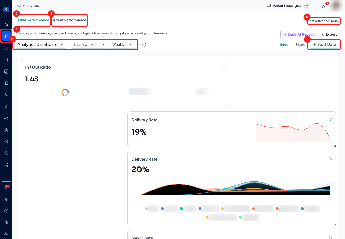
Step 1 — (1) the Analytics icon in the left rail, (2) the Chat Performance tab, (3) the Agent Performance tab, (4) the refresh indicator, (5) the board selector with the window and granularity beside it, (6) Add Data. Chart legends carry real tag and customer names, so they are blurred throughout this article; on your own screen you see them in full.
- (2) Chat Performance — the default board. Volumes, response speed, delivery and failure rates, across every channel you have connected. This is the board the rest of the steps work on.
- (3) Agent Performance — the same machinery pointed at your team instead of your customers: who handled how many chats, how fast, and how happy the customer was. Steps 12 and 13 cover it.
- (5) The board selector reads Analytics Dashboard on a new workspace. It lists every board your workspace has and switches between them; each row also carries a bin icon, which deletes that board after a confirmation and cannot be undone.
- (6) Add Data opens the catalogue of metrics that are not on your board yet. Step 10.
📣 Analytics measures conversations, not campaigns. If you want to know how one broadcast performed — delivered, read, failed, per recipient — that lives on the broadcast itself: the progress bar on its row in Marketing → Broadcasts, and View Recipients on the row menu. Module 4 covers it.
Step 2 — Set the reporting window
Every figure on the board is "for the selected period", so the window is the first thing to get right. Click the period button — it reads Last 4 weeks until you change it — and pick from four options.
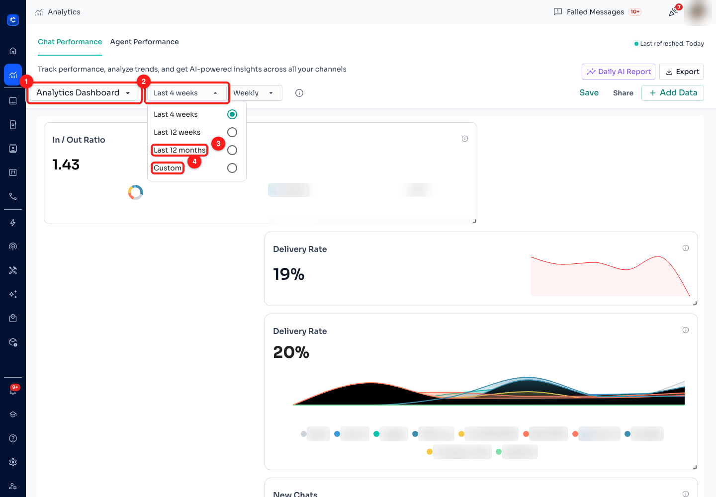
Step 2 — (1) the board selector, (2) the period button, (3) Last 12 months, (4) Custom. Last 4 weeks and Last 12 weeks sit above them in the same menu.
- Last 4 weeks — the default, and the right one for "is this month better than last". It is a rolling 28 days ending today, not a calendar month.
- Last 12 weeks and Last 12 months — for trends. Use these when you want to see seasonality rather than the effect of last Tuesday.
- Custom — pick your own start and end dates. Use it to measure a specific campaign window or a month you need to report on exactly.
⚠️ Changing the period reloads every card on the board, so give it a few seconds. It also changes what the previous period means — a card comparing against the previous cycle (Step 9) compares against the 28 days before your 28 days, not against last calendar month.
Step 3 — Choose how finely to slice it
The button next to the period sets the granularity — the size of one point on a line chart. Daily shows you the spike on the day it happened; Weekly smooths it into a trend.
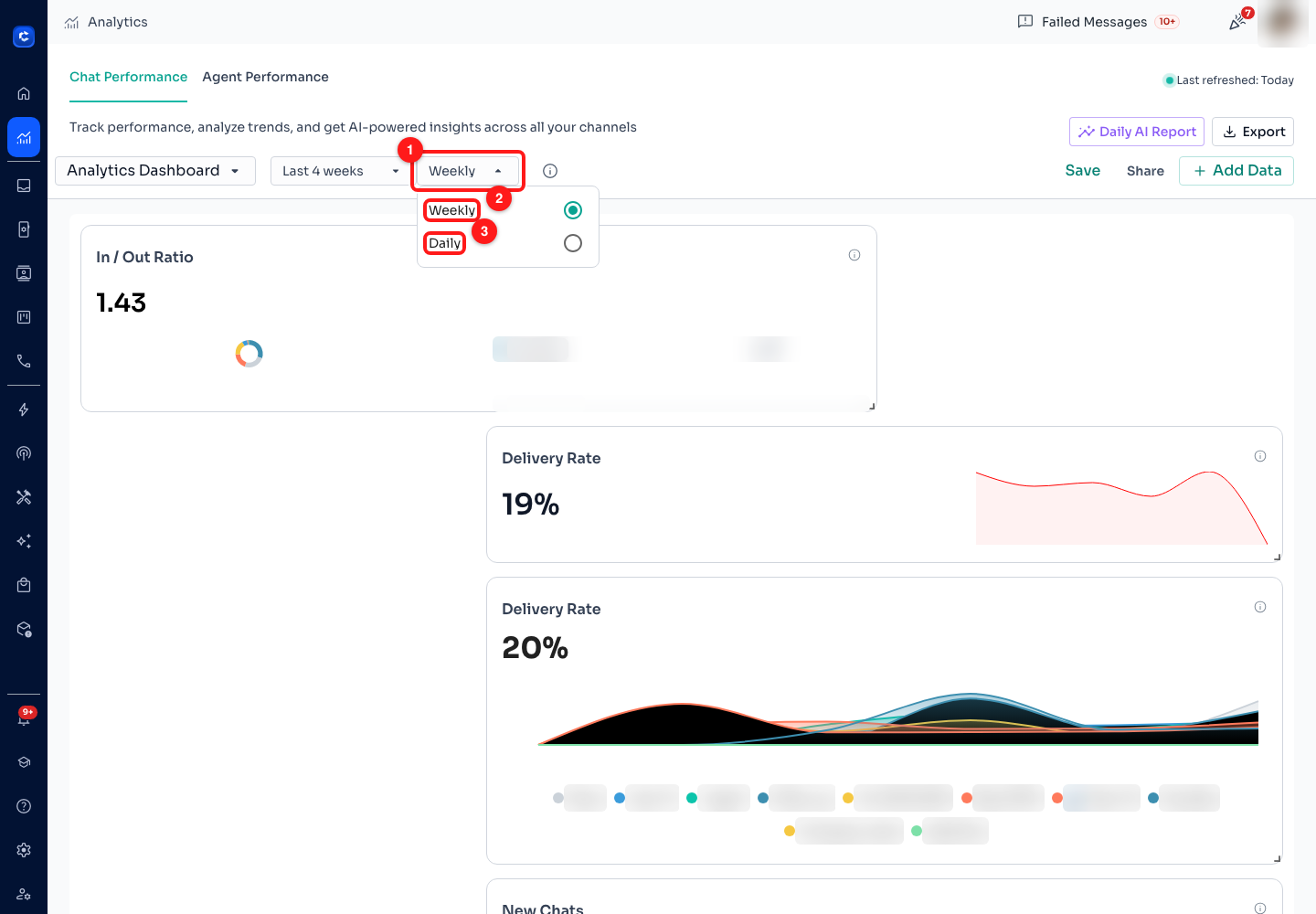
Step 3 — (1) the granularity button, (2) Weekly, (3) Daily. On a 28-day window these are the only two choices offered.
- Daily — one point per day. Best for short windows and for finding the day something broke.
- Weekly — one point per week. Offered once the window is at least 14 days long.
- Monthly — one point per month. Offered once the window is at least 30 days long, which is why it is absent on the default 28-day window and appears as soon as you switch to Last 12 weeks or Last 12 months.
💡 If Monthly has "disappeared", nothing is broken — your window is shorter than 30 days. Widen the period and it comes back.
Step 4 — Read one card, and check what it actually counts
This is the habit worth building, and it is what the second video lesson is about. Before you act on a number, read its definition. Every card carries a small information circle at its top-right; hover it and the app shows you the metric in plain English and the formula behind it.
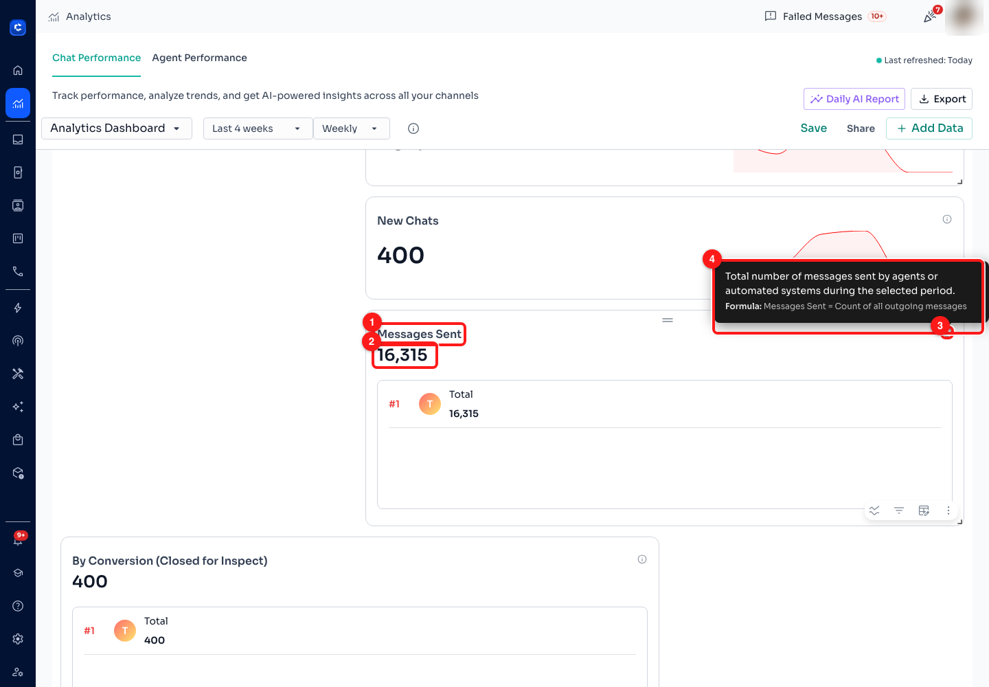
Step 4 — (1) the card title, (2) the headline figure for the selected period, (3) the information circle, (4) the definition and formula it reveals on hover.
- (2) The headline figure is the total across the whole window, not the latest day. The chart or table underneath is that same total broken out over time.
- (4) The tooltip gives you both halves — a sentence describing the metric, and a Formula line. In this screenshot: Messages Sent = Count of all outgoing messages. Outgoing means everything your side sent, whether an agent typed it, an automation fired it or a broadcast delivered it.
- Read the formula before you compare two numbers. Several metrics on this board are percentages of different denominators, so they are not comparable to each other even when both read "20%".
The full list of definitions is in the What each metric measures section further down, so you can check one without hovering every card.
Step 5 — The controls every card carries
Hover a card and a strip of small controls appears at its bottom-right, with a pencil beside the title. They only render while the pointer is over the card, which is why they are easy to miss. The next four steps take them one at a time.
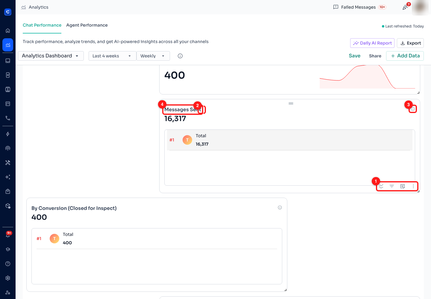
Step 5 — (1) the control strip: breakdown, filter, visualisation, more actions, (2) the rename pencil, (3) the information circle, (4) the card title.
- (1) The strip, left to right: breakdown (split the metric by a property), filter (narrow this card to a slice), visualisation (change the shape it is drawn in) and more actions.
- (2) The pencil renames the card. The name is yours — Messages Sent can become Outbound volume (all channels) if that is what your team calls it. Renaming does not change what is counted.
- The small drag handle at the top centre of the card moves it; the corner of the card resizes it. Both change the board layout, and like every other change on this page they are local until you press Save (Step 11).
🎯 Not every card shows all four controls. Breakdown only appears on metrics that have properties to break down by, so a pure rate card may show three. A funnel card gains an extra layers control for configuring its stages.
Step 6 — Break a metric down by a property
A total tells you how much. A breakdown tells you where it came from, and it is the single most useful control on this page. Click the breakdown icon and pick one property; the card splits into one series per value.
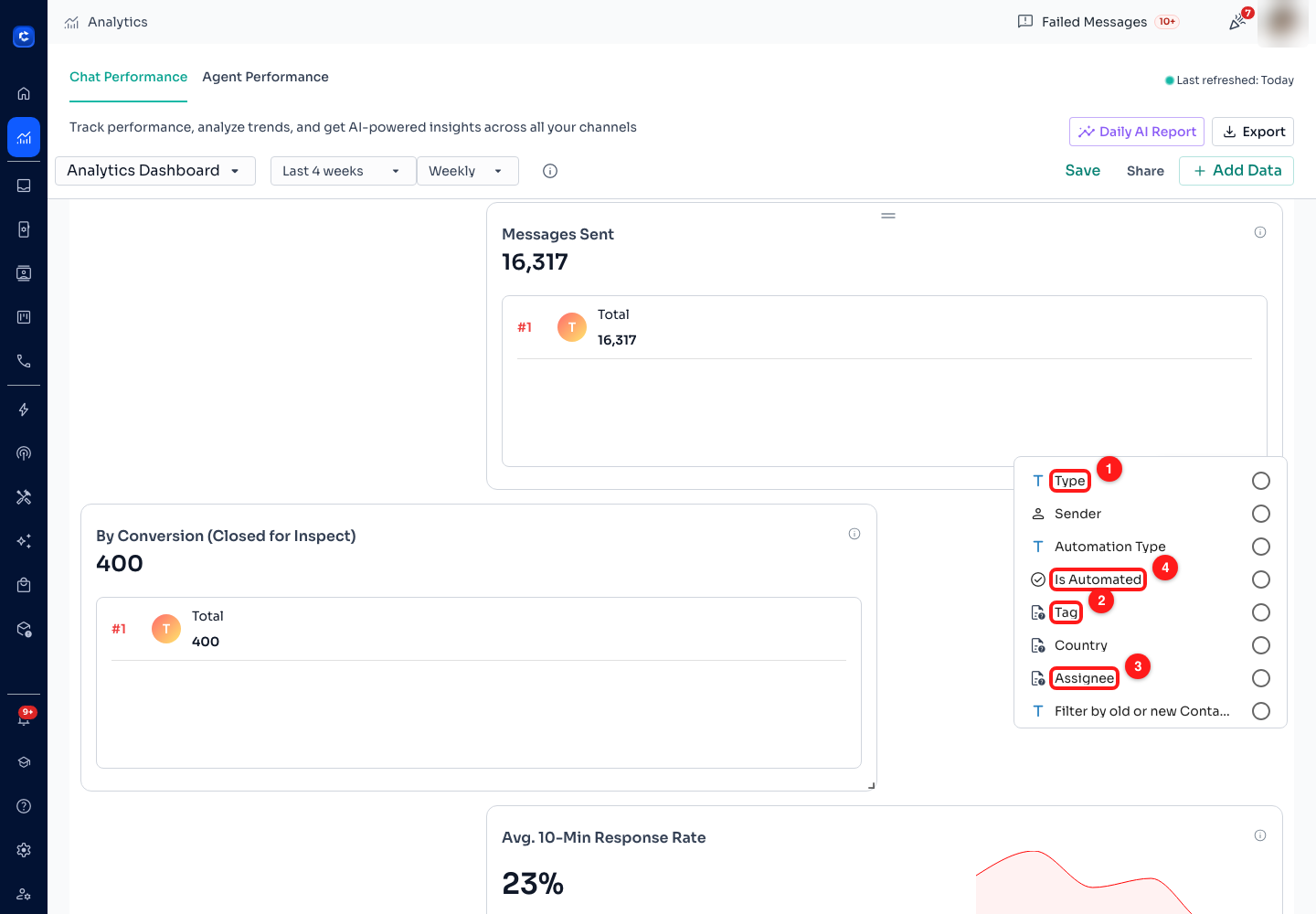
Step 6 — (1) Type, (2) Tag, (3) Assignee, (4) Is Automated. Sender, Automation Type, Country and contact age sit in the same list.
- (2) Tag is the payoff for Module 7. Break New Chats down by tag and you find out which segment is actually generating conversations, rather than guessing.
- (3) Assignee splits the metric by the teammate the chat is assigned to — the quickest way to see workload spread across the team from the Chat Performance side.
- (4) Is Automated splits your side of the conversation into what a human sent and what a bot sent. Run it against Messages Sent after Modules 5 and 6 and you can see exactly how much work the automations took off your team.
- Country and Channel are the ones to reach for when you run more than one number or sell in more than one market.
⚠️ A breakdown applies to that one card, not the board. It also changes what the card can be: switching a broken-down card to Snapshot clears the breakdown, because a snapshot has room for one number only.
Step 7 — Filter one card to a slice
Breakdown splits a card into parts. Filter throws the other parts away. Click the filter icon and a panel opens with one dropdown per property — set any of them and this card counts only the matching conversations.
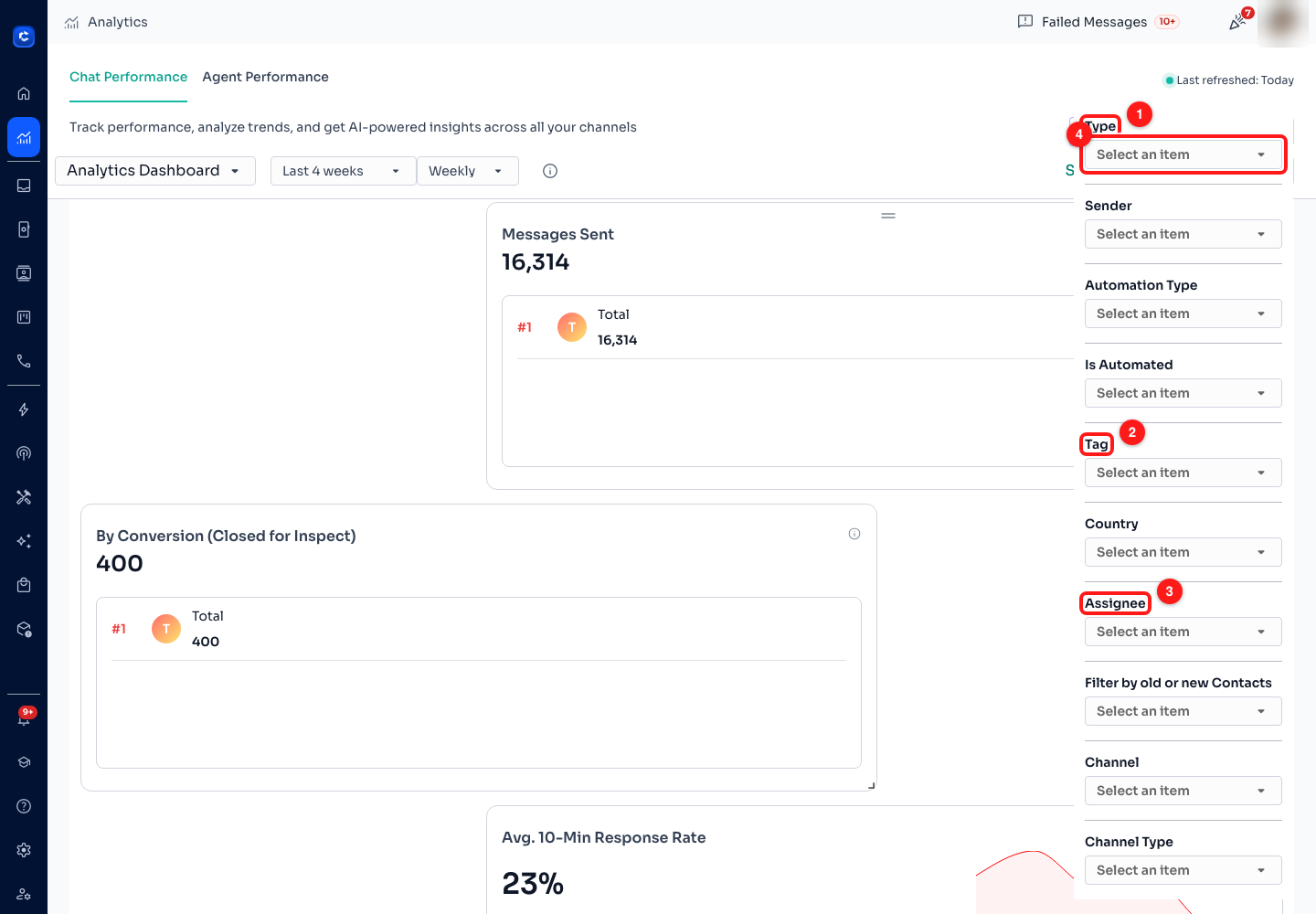
Step 7 — (1) Type, (2) Tag, (3) Assignee, (4) each property is a "Select an item" dropdown. Country, Channel, Channel Type, Sender, Automation Type and contact age follow below in the same panel.
- Use it to build a board that answers one question. Filter three cards to a single Channel and you have a board for that number alone, sitting beside the whole-business cards.
- Filter and breakdown combine: filter a card to one channel, then break it down by tag, and you get the tag mix within that channel.
- A filtered card looks exactly like an unfiltered one at a glance. Rename it (Step 5) to say what it is filtered to, or somebody will read it as a company-wide total.
Step 8 — Change how a card is drawn
The third control changes the shape, not the data. Pick the one that suits the question — a total over time is a line, a share of a whole is a pie, and a number somebody needs to read across the room is a snapshot.
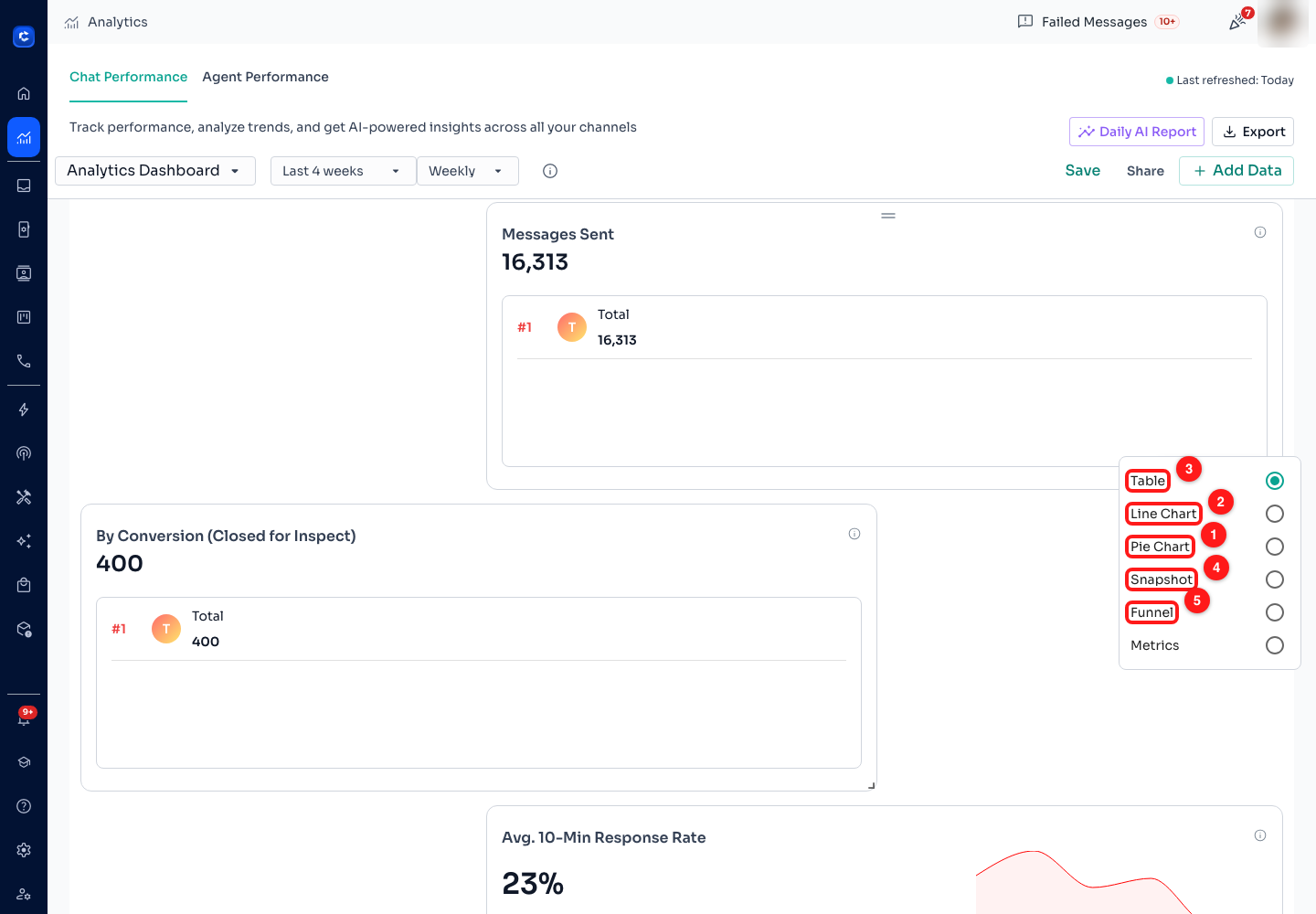
Step 8 — (1) Pie Chart, (2) Line Chart, (3) Table (selected here), (4) Snapshot, (5) Funnel. Metrics is the sixth option in the same list.
- Line Chart — the shape of a metric over time. This is the one that shows you a trend and the day it turned.
- Pie Chart — share of a whole. Only useful on a card that has a breakdown; without one it is a single slice.
- Table — the exact figures, ranked. Best when you need to read values rather than shapes, and the easiest to copy from.
- Snapshot — one big number. Good for the two or three figures you want visible without scrolling. Choosing it clears any breakdown on the card.
- Funnel — stages that narrow, for measuring drop-off between steps. A funnel card carries its own layers control for defining those stages.
Step 9 — Compare with last period, or take the data away
The last control on the strip is the overflow menu. It holds the three things you do to a card once it says something interesting.
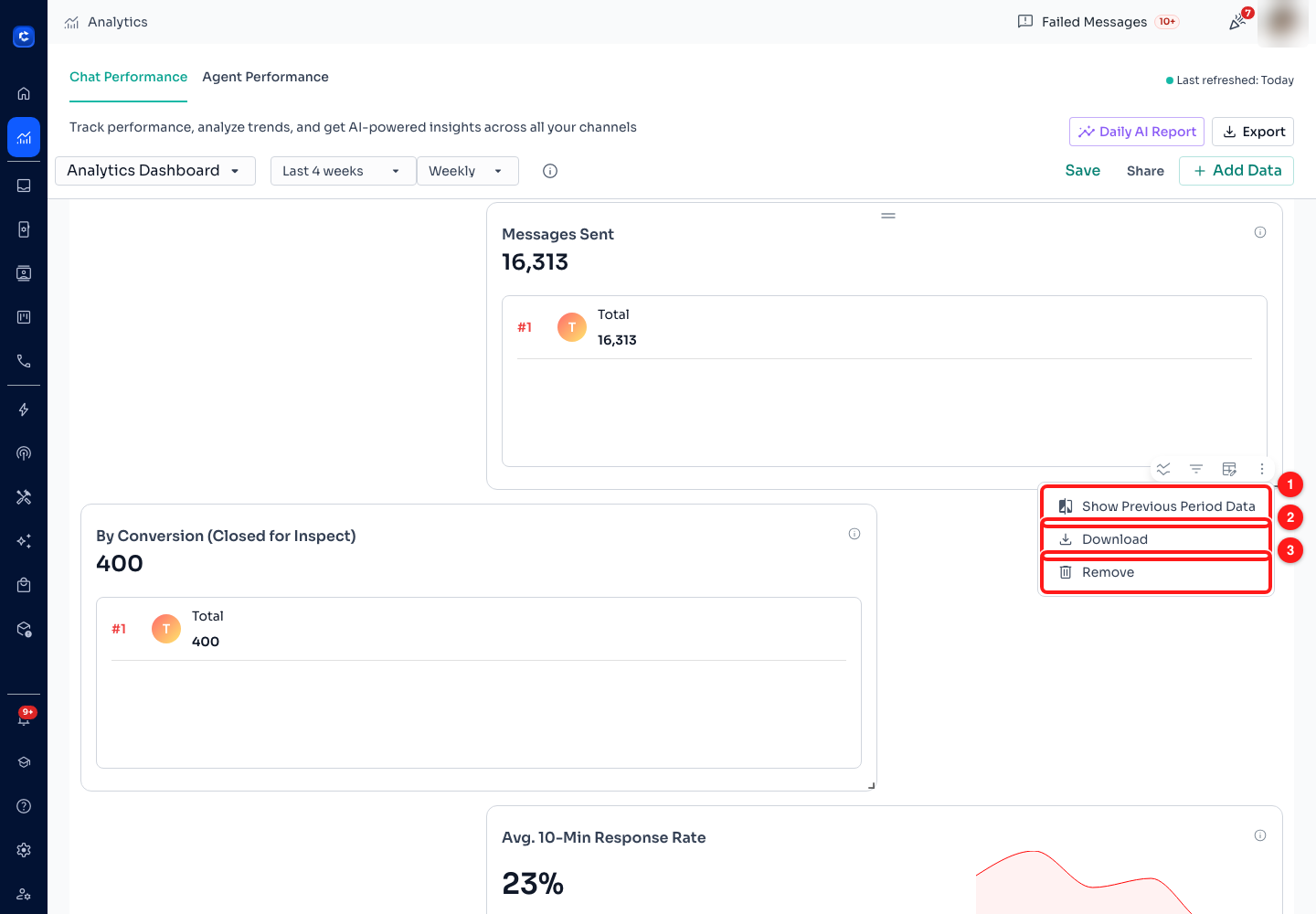
Step 9 — (1) Show Previous Period Data, (2) Download, (3) Remove.
- (1) Show Previous Period Data overlays the equivalent window before this one, so "1,200 messages" becomes "1,200, up from 900". Once on, the same menu item reads Hide Previous Period Data. This is the fastest way to turn a number into a judgement.
- (2) Download saves this card alone as a CSV — the series and their values, named after the card. Use it when somebody wants one metric in a spreadsheet rather than the whole board (that is Export, Step 15).
- (3) Remove takes the card off the board. It does not delete any data, and like every other change here it is not final until you press Save — so a mistaken removal is undone by reloading the page without saving.
- On a card that already has a breakdown, a fourth item appears: Hide None Values from Breakdown, which drops the "no tag / no assignee" series so the ones you care about are readable.
Step 10 — Add a metric the board is not showing
The board you start with is a sensible default, not the full set. Click + Add Data in the toolbar to open the catalogue of every block available, each one previewed with your own live figures so you can see what you would be adding.
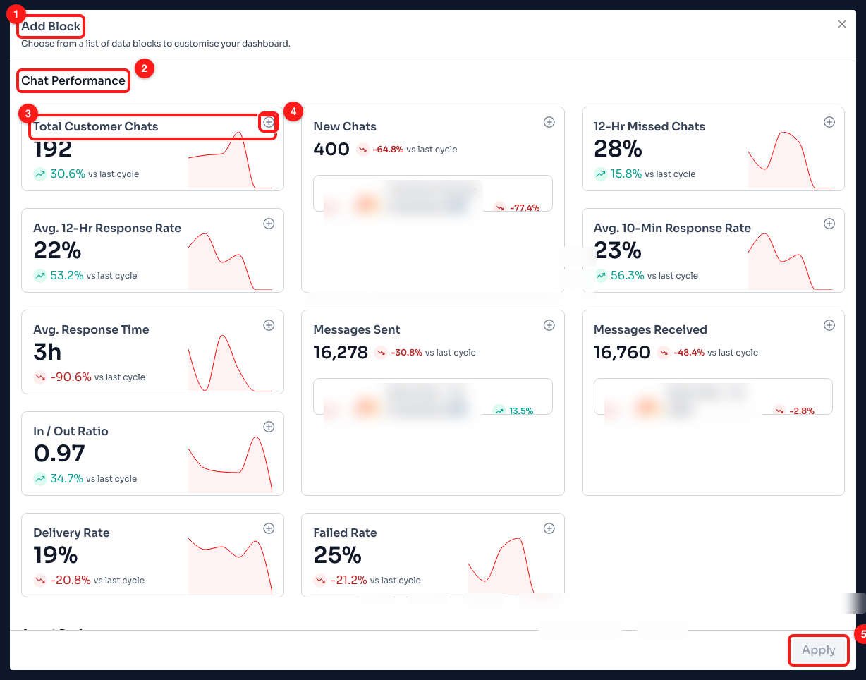
Step 10 — (1) the Add Block dialog, (2) the Chat Performance group, (3) one block with its live preview and its change against the last cycle, (4) the + button that adds it, (5) Apply. Preview figures are this workspace's real data.
- Blocks are grouped by board — Chat Performance first, Agent Performance below it. Adding an agent block puts it on the board you are currently looking at.
- (3) Each preview shows the current value and the change vs last cycle, so you can tell whether a metric is worth a permanent slot before you commit to it.
- (4) The + button on a card marks it for adding; (5) Apply puts the marked blocks on the board. Closing the dialog without pressing Apply adds nothing.
- New blocks land at the bottom of the board. Drag them where you want them, then Save.
Step 11 — Save the board, then decide who else sees it
Everything you have done so far — added, removed, filtered, renamed, moved — lives in your browser until you press Save. The Save button only appears when there is something to save, which is a useful signal in itself. Once the board is saved, Share decides who else gets it.
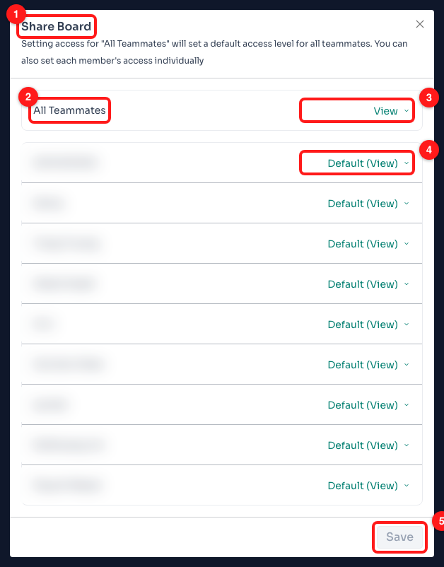
Step 11 — (1) the Share Board dialog, (2) the All Teammates row that sets the default, (3) the access dropdown, (4) a teammate row inheriting that default, (5) Save. Teammate names are blurred.
- (2) All Teammates sets one default for the whole workspace. The three levels are View, Edit and No Access.
- (4) Individual rows override that default. A row left alone reads Default (…) and follows whatever All Teammates is set to, so you only touch the people who need something different.
- View lets somebody open and read the board. Edit lets them add, remove and rearrange cards and save those changes for everybody who sees it.
- (5) Save in this dialog saves permissions, and stays greyed out until you have actually changed one. It is separate from the board Save in the toolbar — closing the dialog without pressing it discards the access changes.
🔐 Share is greyed out until the board has been saved at least once — hover it and the tooltip reads Save your dashboard to share. And if you open a board somebody else owns without Edit access, the toolbar offers Request Edit Access instead of Save, naming the teammate to ask.
Step 12 — Switch to Agent Performance
The second tab at the top of the page swaps the customer-facing metrics for team-facing ones. Everything you learned in Steps 4 to 9 works here too — the cards carry the same controls and the same period applies.
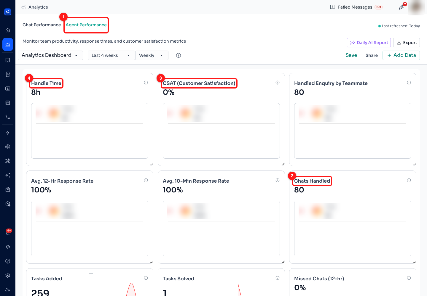
Step 12 — (1) the Agent Performance tab, (2) Chats Handled, (3) CSAT (Customer Satisfaction), (4) Handle Time. Each card's ranked breakdown lists real teammates, so those rows are blurred.
- (2) Chats Handled counts chats assigned to an agent — the volume side of the picture.
- (3) CSAT is the share of ratings that were positive. It is only meaningful once customers are actually rating chats; with no ratings there is nothing to average.
- (4) Handle Time is how long a chat stayed open from start to end, averaged. It is a different question from response time — a chat can be answered in seconds and still take three days to close.
- Read these three together. High volume with slow handle time is a capacity problem; low volume with slow handle time is not.
- The rest of the board holds Avg. 12-Hr Response Rate, Avg. 10-Min Response Rate, Avg. Response Time, Missed Chats (12-hr), and Tasks Added and Tasks Solved for teams using tasks. The card reading Handled Enquiry by Teammate in this screenshot is a renamed one — proof that Step 5's pencil sticks.
Step 13 — Read the per-agent leaderboard
Below the cards, the Agent Performance board ends in a table with one row per teammate. This is the screen the first video lesson means by "agent performance at a glance", and it is the one to open before a one-to-one.
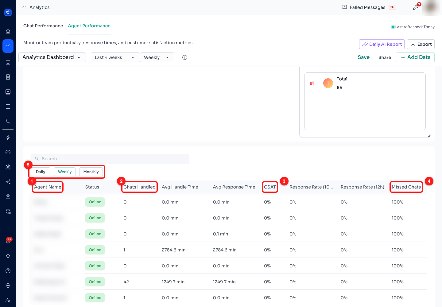
Step 13 — (1) Agent Name, (2) Chats Handled, (3) CSAT, (4) Missed Chats, (5) the Daily / Weekly / Monthly filter. Teammate names are blurred.
- The nine columns are Agent Name, Status, Chats Handled, Avg Handle Time, Avg Response Time, CSAT, Response Rate (10m), Response Rate (12h) and Missed Chats. Handle and response times are shown in minutes, the rest as counts or percentages.
- Status is the agent's current online / offline state, not a figure for the period. The search box above the table matches on name and status, so typing offline filters the table to whoever is away.
- (4) Missed Chats is a percentage of that agent's assigned chats that went unanswered for twelve hours. It is the column to look at first — it finds the person who is assigned more than they can carry.
- (5) The Daily / Weekly / Monthly filter on this table is its own control, separate from the board granularity at the top of the page.
⚖️ Two honest cautions before you use this table in a performance conversation. Chats are counted by assignment, so a team that assigns unevenly will produce a leaderboard that measures the routing rules rather than the people. And an agent handling harder cases will always look slower on Handle Time. Use it to start the conversation, not to end it.
Step 14 — Let the Daily AI Report read the board for you
Nobody opens a dashboard every morning. Daily AI Report, in the toolbar, turns the last 24 hours into a few paragraphs of English — what moved, by how much, and what to do about it — and can put it in your inbox.
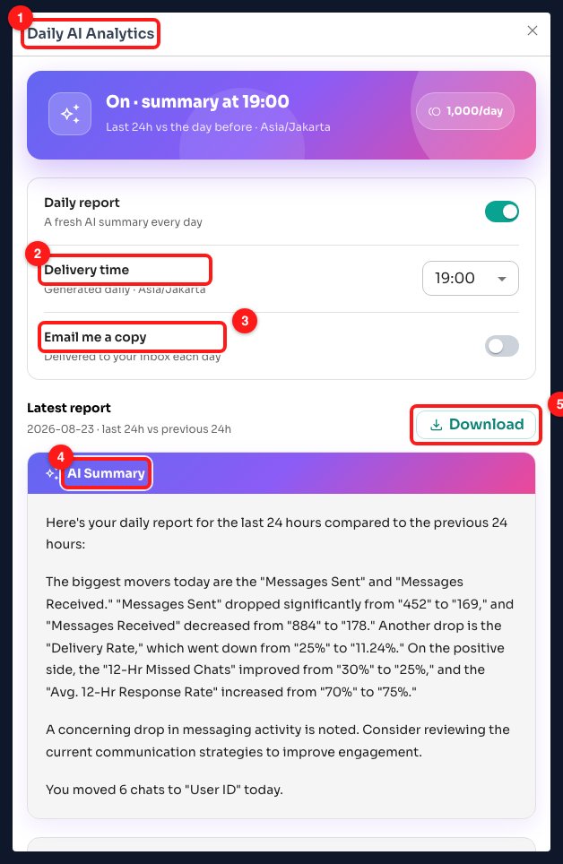
Step 14 — (1) the Daily AI Analytics dialog, (2) Delivery time, (3) Email me a copy, (4) the AI Summary of the latest report, (5) Download.
- (2) Delivery time is the hour the report is generated, shown and set in your own timezone — the browser's. A teammate in another country sees the same report at the time that suits them.
- (3) Email me a copy sends it to your inbox each day as well as leaving it here.
- (4) The summary compares the last 24 hours against the previous 24 hours and writes the change in words: which metrics rose, which fell, and which one it thinks needs attention.
- When a metric has dipped, the dialog adds clickable suggestions below the summary that take you straight to the feature that lifts it — a Keyword Reply or an Automation when response times drift (Module 6), a Broadcast when new chats dry up (Module 4). If nothing slipped, no suggestions appear.
- (5) Download saves the report so you can forward it or file it.
🪙 This one costs credits. Each generated report costs 1,000 credits, and the dialog shows you roughly how many days your current balance covers. If the balance runs out the report is skipped rather than part-generated, and the dialog says so. Depending on your plan the daily report may already be switched on — check this dialog if you would rather it were not.
Step 15 — Export the board
The last button in the toolbar takes the whole board out of ChatDaddy, for the monthly report somebody else needs or for a spreadsheet you want to do your own maths in.
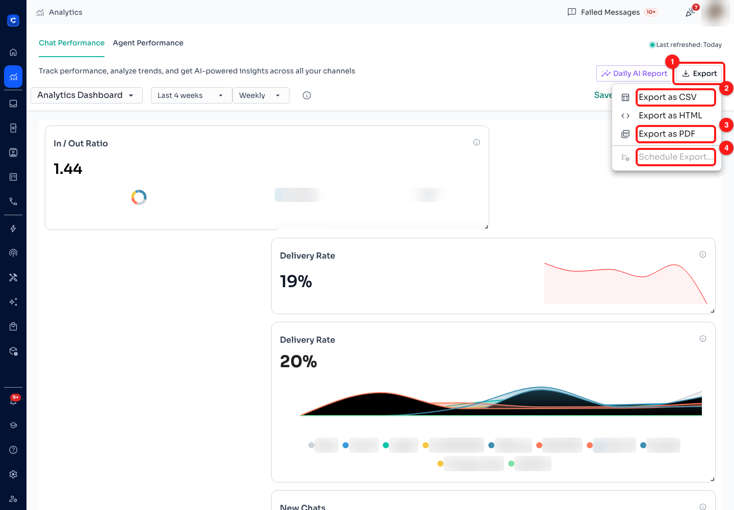
Step 15 — (1) the Export button, (2) Export as CSV, (3) Export as PDF, (4) Schedule Export, which is greyed out. Export as HTML sits between CSV and PDF in the same menu.
- CSV — the figures, for a spreadsheet. This is the one to pick if the numbers are going anywhere other than a human's eyes.
- HTML and PDF — the board as it looks, captured as an image of the cards rather than as figures. PDF opens a new browser tab and hands it to your printer dialog, where you save as PDF — so if nothing happens when you click it, your pop-up blocker stopped the tab.
- The export covers the board as it currently stands — the tab you are on, the period you set, and any filters on individual cards. Set the window before you export, not after.
- (4) Schedule Export… is disabled, with a Coming soon tooltip. Until it ships, the Daily AI Report in Step 14 is the way to get something arriving on a schedule.
What each metric measures
This is the second video lesson in list form. Every formula below is the app's own, taken from the information circle on the matching card — so if a number ever looks wrong, check it here first. Chat Performance:
- Total Customer Chats — count of all chat sessions initiated by users.
- New Chats — count of first-time interactions. The difference between this and Total Customer Chats is your returning customers.
- 12-Hr Missed Chats (%) — chats with no response within 12 hours, ÷ total chats.
- Avg. 12-Hr Response Rate (%) — chats responded to in under 12 hours, ÷ total chats.
- Avg. 10-Min Response Rate (%) — chats responded to in under 10 minutes, ÷ total chats. The one to watch if you promise a fast first reply.
- Avg. Response Time — the sum of (first response − chat start), ÷ the number of responded chats. Unanswered chats are not in this average, which is why you read it beside Missed Chats rather than on its own.
- Messages Sent — count of all outgoing messages.
- Messages Received — count of all inbound customer messages.
- Message Ratio (the In / Out Ratio card) — Messages Sent ÷ Messages Received. Around 1 means a balanced conversation; far above 1 means you are talking more than they are.
- Delivery Rate (%) — delivered messages ÷ total messages sent.
- Failed Rate (%) — failed messages ÷ messages sent. A rising failed rate is a channel health problem, not a content problem — Module 2 covers what to do about it.
Agent Performance:
- Chats Handled — count of chats assigned to the agent.
- Handle Time — the sum of (chat end − chat start), ÷ the number of chats handled.
- CSAT (%) — positive ratings ÷ total ratings.
- Missed Chats (%) — chats not replied to within 12 hours, ÷ assigned chats.
- Avg. 12-Hr Response Rate (%) — replied within 12 hours ÷ assigned chats.
- Avg. 10-Min Response Rate (%) — replied within 10 minutes ÷ assigned chats.
- Avg. Response Time — the sum of response times per chat, ÷ the number of responded chats.
🧮 Note how many of these are ratios over different denominators — total chats on the Chat board, assigned chats on the Agent board. A team-wide 12-hour response rate and one agent's 12-hour response rate are answering different questions, so do not expect the agent figures to average out to the team figure.
The two video lessons in this module
Both open inside ChatDaddy from the Academy page, or on YouTube using the links below.
- How to use the Dashboard · 1:13 · beginner · where to find response times, volumes and agent performance at a glance — Steps 1 to 3, and Steps 12 to 13 for the agent side.
- How the Dashboard analyses your WhatsApp data · 2:57 · intermediate · what each metric actually measures and the decisions it should drive — Step 4, the What each metric measures section above, and the Daily AI Report in Step 14.
Common questions
Every card reads zero. Is Analytics broken?
Check three things in order. First the period — a Custom window with the wrong dates will honestly report nothing. Second the card's own filter (Step 7): a card filtered to a channel or tag that had no activity reads zero while the board around it does not. Third, whether the workspace actually has conversations in that window — a channel connected last week has nothing to show for last month.
I rearranged the board and it reverted when I reloaded.
Board changes — adding, removing, filtering, renaming, moving and resizing — are local until you press Save in the toolbar. The Save button only appears when there is an unsaved change, so if you cannot see it, there is nothing pending. If the toolbar offers "Request Edit Access" instead of Save, the board belongs to somebody else and you have View access only — the dialog names the teammate to ask.
Why has the Monthly granularity option disappeared?
Granularities are only offered when the window is long enough to fill them: Weekly needs at least 14 days, Monthly at least 30. The default window is 28 days, so Monthly is hidden until you switch to Last 12 weeks, Last 12 months, or a Custom range of 30 days or more.
Where do I see how one broadcast performed?
Not here. Analytics measures conversations across your channels; a single campaign's delivered, read and failed counts live on the broadcast itself, in Marketing → Broadcasts — the progress bar on its row, and View Recipients on the row menu for the per-recipient detail. Module 4 walks through it.
Can I send this board to somebody outside my team?
Sharing is internal only — the Share dialog lists your workspace teammates and nobody else. To get the board to somebody outside, use Export (Step 15): PDF or HTML for something readable, CSV for the raw figures.
What does the Daily AI Report cost, and can I turn it off?
Each generated report costs 1,000 credits, and the dialog estimates how many days your balance covers. If you run out, the next report is skipped rather than partly generated. The Daily report toggle at the top of the same dialog turns it off — worth checking, because on some plans it is on by default.
➡️ Next: Module 9 — Integrations. Four lessons on wiring ChatDaddy into the tools you already run: Shopify order notifications on WhatsApp, WhatsApp messages triggered by a form submission, GoHighLevel notifications, and click-to-WhatsApp ads on Facebook.